Improving Cancer Detection
Startup company Diagnostics for All created a paper-based tool for patients and healthcare providers living in developing countries to diagnose cancer with a color-matching exercise. However, they were worried users would incorrectly match colors. We prototyped new ideas and tested them out, iterating daily.
Outcome:
We reduced error rates from over 5% to 0%. We increased patients’ confidence to 10/10.
While this was a small study, it’s an excellent example of rapid prototyping—we tested over 30 different ideas in the span of a week. Each iteration helped us hone in and better understand what people need when matching colors and using medical equipment.

The diagnostic guide emphasized numbers, which confused the participants. Colors were small and surrounded by a large amount of gray, which understated their importance. The instructions were separate from the diagnostic tool, and the participants consistently did not read them.

We added more colors, removed the numbers, and included the instructions on the tool. People became more confused by the gradient, as they were not sure which of the many options their color fell into when there was not an exact match. Because the calibration match was at the end, we continued to see few people using it. They were also confused by shorthand jargon.
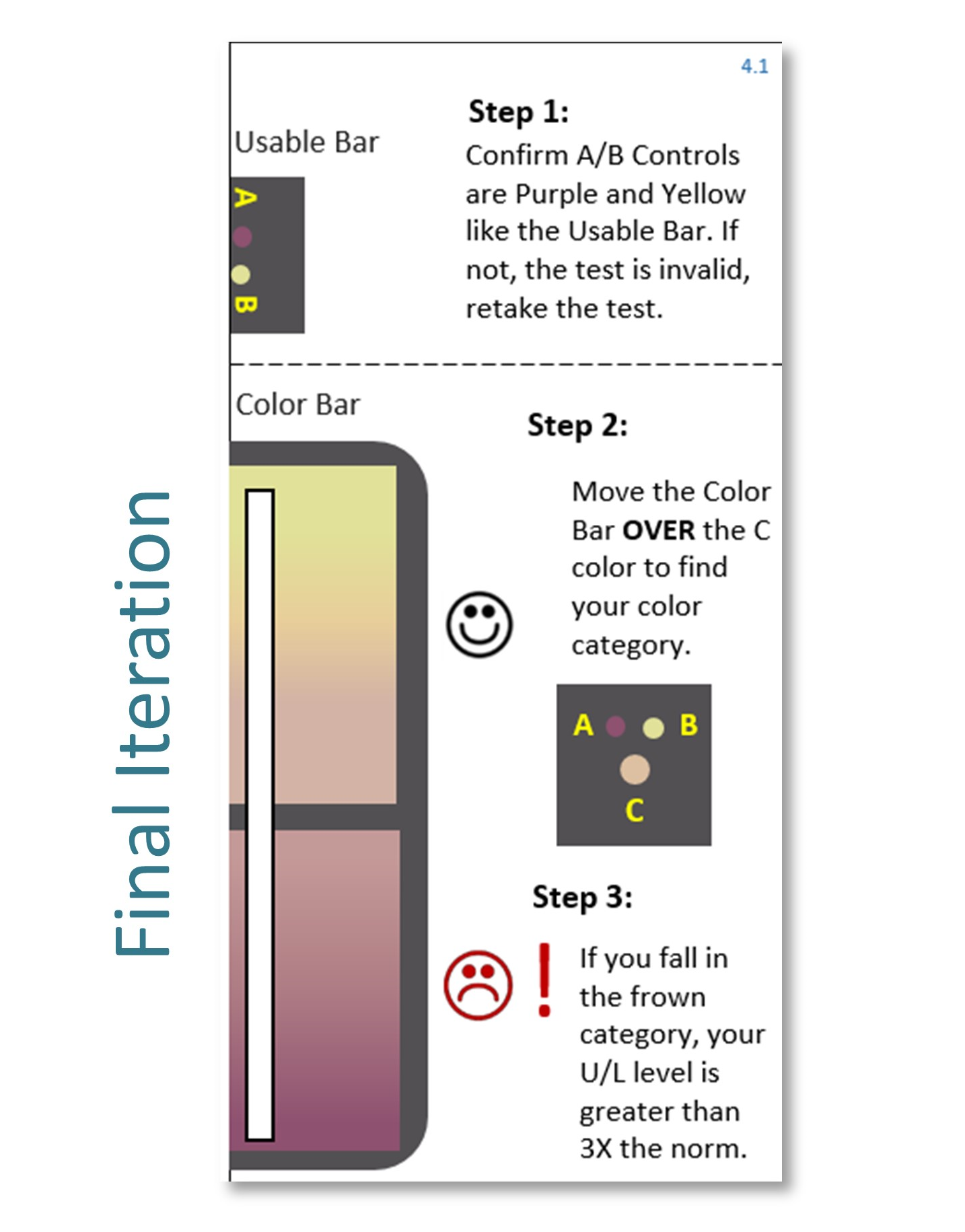
We fully implemented and embedded instructions into the diagnostic tool, starting with Step 1 at the top. Smiley faces were used to indicate positive and negative, as they were internationally understood and did not drown users in medical jargon. We found that participants were much more accurate when they overlaid the colors of their test strips to touch one another. To encourage this behavior, we cut a slit in the gradient so users would naturally overlay the matching sheet with the diagnostic square. An unobstructed gradient allowed users to find their exact color and eliminate uncertainty.